Note: this article was originally published on Hockey-Graphs 2019-01-06
In part 1 of this series we covered the history of WAR, discussed our philosophy, and laid out the goals of our WAR model. In part 2 we explained our entire modeling process. In part 3, we’re going to cover the theory of replacement level and the win conversion calculation and discuss decisions we made while constructing the model. Finally, we’ll explore some of the results and cover potential additions/improvements.
Replacement Level
Replacement level as a concept is a very important aspect of all WAR models – it’s right there in the name. The concept of replacement level was first proposed by Bill James in some of his work done in the early 1980s (here’s a good history of it from BP). Eventually, replacement level became the go-to “baseline” for baseball player evaluation and is quite common today.
That said, it might be hard to understand why we use replacement level and not average as our baseline – the concept of “average” is very common and well understood by most. But the issue within evaluation here is that an “average” player is valuable; when we baseline our metric around an average player, we lose an ability to apply meaningful context to our evaluation. Replacement level, on the other hand, sets the baseline lower – the baseline now becomes the level at which a player can be determined to be “replaceable” i.e. easily substituted for another readily-available player. Bill James stated it this way:
“The line against which a player’s value should be measured is the replacement level. The replacement level is a very real, very tangible place for a baseball team or a baseball player; drop under it and they release you.”
This philosophical notion of replacement level, however, isn’t just important for giving context to our metrics or introducing a convenient point at which we can criticize a player’s worth, as it’s (unfortunately) often used. Lowering the baseline to a replacement level gives us the added benefit of a necessary adjustment for our population. I’m going to cite Colin Wyers’ BP series from part 1 where he explains the need for this baseline wonderfully. It would be nice if there was an easy quote to grab from this excellent article that would summarize everything we’d like to discuss, but there isn’t so we implore you to give it a read. Briefly, there is an additional issue that arises when we compare players with disparities in their playing time.
Take for instance Connor McDavid and Auston Matthews in the ’17-18 season. McDavid played 1767 minutes and Matthews played 1124 minutes – that’s a difference of 643 total minutes between the two. When comparing these players, an above-average baseline assumes that league average players would play the 643 minutes that Matthews did not play compared to McDavid, but we know this is incorrect (at least theoretically). Keith Woolner puts this even more succinctly in his Marginal Lineup Value write-up here.
“One problem with comparing a player to league average is that it assumes that a league average performance has a value of zero. In reality, league average players are quite valuable as they are somewhat difficult to find.”
League-average players are not readily available to fill this time, but we also know these theoretical minutes will not be played by an “absolute zero” player (as baseball might call it an “all-outs batter”): it’s somewhere in between, or replacement. Fangraphs’ explainer here does a good job of summarizing this as well:
“Does it really matter if you compare Andrew McCutchen and Mike Trout to the average player or a replacement one? If you only care about which one is better, not really. You’ll be able to work with their stat lines. But if you want a better handle on most of the league, a baseline that incorporates performance and playing time is vital. You can’t do that with average as your baseline. And it’s also important because we’re talking about the true bottom of the MLB talent pool.”
So given that we need to adjust our baseline to replacement level, how are we going to determine where that baseline should be in hockey? This isn’t new; others have used replacement level in the past and have proposed multiple ways for determining this. We actually already covered this in the 2nd part of our wPAR write-up – we’ll get back to something we discuss here in a bit. Let’s take this a step further. Here are several ways replacement level can be determined:
- Bill James, referenced in the above BP article, proposed that a replacement level player is a .350 player. That is, if average is a .500 player, replacement level would be ~15% worse than average.
- Keith Woolner proposed a method that has become a starting point for this discussion in the MLV explainer linked above. “This author’s idea is to measure the performance of the league with all of the regular players (starters) removed, essentially measuring the aggregate performance of backups, injury replacements, undeveloped talent, and journeymen players.”
- Both Baseball-Reference and Fangraphs use an ad hoc method for determining their replacement level. In response to discrepancies between each method’s baseline, Fangraphs and BR decided to “unify” their respective replacement levels [here] (although their actual explainer is a bit different). Either way, their replacement level is “set at 1,000 WAR per 2,430 Major League games, which is the number of wins available in a 162 game season played by 30 teams. Or, an easier way to put it is that our new replacement level is now equal to a .294 winning percentage, which works out to 47.7 wins over a full season.”
- Daniel Myers used the following discussion on Tom Tango’s blog for the basis for BPM’s replacement level, which took Woolner’s idea a step further. He looked at only starters at a given time – for instance we would exclude all starters at the beginning of a season and measure how all other players performed, aggregate this performance, and use this aggregate for our replacement level.
- In our (now defunct) wPAR metric write-up, we took Tango’s idea in the comments linked in point 3 and measured replacement level based on league-minimum salary performance. Emmanuel Perry uses this method for his WAR model as well [here].
- WOI used what they called “poor man’s replacement” where they “set a threshold value for which all players under get pooled together as the canonical ‘replacement’ player.” In the article, this was demonstrated with faceoffs, but per A.C. Thomas’ comments in this great panel discussion it appears this was the replacement level they used for their entire model. The WOI team also proposed a Bradley-Terry model built into a logistic regression that determines a baseline, but it is unclear if this was used.
- openWAR takes this a step further in describing what this “threshold value” looks like: “Since there are 30 major league teams, each of which carries 25 players on its active roster during the season, there are exactly 750 active major league players on any given day. We use this natural limitation to demarcate the set of major league players, and deem all others to be replacement-level players.”
As mentioned, we’ve previously used the minimum contract method to determine replacement level. Briefly, we looked at the performance of all players who were paid league-minimum salaries over a given time-span (in our case this is the RTSS era, since 2007). Using this group of players, we aggregated their performance to determine a replacement baseline (or as WOI puts it the “canonical replacement player”) and adjusted the baseline from average (where 0 is average) to replacement level (where 0 is replacement level). After testing this, we found some issues. Mainly, there are not enough league-minimum players available over the last 11 seasons that played a significant amount of time to properly measure this, or at least enough to arrive at a replacement level we feel is robust enough. This is debatable of course, but in our testing we found a method that was a bit more concrete: “poor man’s replacement”.
There are possibly better ways to determine a replacement baseline, but it seems AC Thomas and crew found something that works quite well. We determine a threshold where all players below that threshold are considered “replacement players”, and we then average all of those players’ performance to arrive at an aggregate replacement player. Of course this player is theoretical, but it gives us a baseline that is both robust in nature (we have as many players available as possible) and easy to understand (our threshold is based on something that everyone is familiar with).
In this case, we’ve set our threshold based on playing time. Even-strength: all forwards below the top 13 forwards per team by TOI within a given season are considered replacement forwards, and all defensemen below the top 7 per team by TOI are considered replacement defensemen. Powerplay and shorthanded play are entirely unique to hockey and require a different approach. This will be addressed a bit later, but for now we’ve set the replacement level for Powerplay as all players below the top 11 players per team by TOI, and the replacement level for Shorthanded as all players below the top 9 players per team by TOI. After this group is determined, these players are then split into forward and defensemen groups and an aggregate replacement level is determined for each position. After we’ve completed this process, we arrive at the following:


These tables show the process for collecting the previously determined “replacement level player” group averages for each position for each component (all columns are sums except for any columns that include “_GP” or “_60”, which are rates per game played and per 60 minutes respectively). Let’s use powerplay offense for forwards as an example. 816 forwards fell into our group of players defined as replacement level from ’07-18. These forwards’ totaled -251.7 PPO goals above average. With the total time on ice (39,063.9 total minutes), we can find the average rate of all of these players, -0.3866 per 60 minutes. In other words: (-251.7 / 39063.9) * 60 = -0.3866. This is our replacement level for forwards’ PPO.
To adjust our baseline from average to replacement level, we multiply a given players’ TOI by the per minute replacement level (-0.3866 / 60), and add that to their total PPO goals above average keeping with the above example. To demonstrate this, in ’17-18 Taylor Hall played 220.2 minutes on the powerplay and produced 6.4 goals above average. To adjust his PPO GAA to PPO GAR, the following calculation is performed. This method is used for all of the components in the model:
220.2 * (0.3866 / 60) + 6.4 = 7.8
or
1.4 + 6.4 = 7.8
Finally, there is one last philosophical note we need to discuss, which brings us back to the Tango blog post and the comments linked above. We discussed this in our wPAR write-up, and we still feel this is an important distinction when discussing the performance of players within a given component relative to a certain replacement level. Tom Tango explains this in the basketball replacement level discussion (comment #131):
“…there are only replacement level PLAYERS. There is no such thing as ‘replacement level’ offense.”
continued (comment #134):
“…if you characterize it as ‘offense above the replacement level player”, that’s different than saying ‘offense above replacement level offense’. Because there is NO SUCH THING as replacement level offense, but you do have offense contributed by replacement level players. It’s not a nuance, it’s not a distinction without a difference. It’s a clear line that talks about players as players.”
The point here is that within an area of the game that contains more than one measurable component, we shouldn’t isolate replacement level for each of the sub-components. The obvious example here is even-strength states – in our model we measure players at even-strength for both offense and defense when adjusting from average to replacement level. Even-strength offense and defense are combined into one “even-strength above replacement” component, and it all stems from this idea. There is no such thing as replacement level even-strength offense because a player does not have a choice of whether they contribute concurrently to their team’s defense at even-strength. If a skater is playing in an even-strength state, they are playing offense and defense regardless, and when measuring or determining a certain replacement level for a certain component, that skater should be compared to a baseline skater overall in that state. We’ve only included powerplay offense and shorthanded defense in our model due to what we’ve determined to be the irrelevant aspects of powerplay defense and shorthanded offense, but we’ve set replacement level for powerplay and shorthanded states in a similar manner here. If we were including those counterparts, they would be combined in the replacement level component as well. The penalty component follows this same idea – both penalties drawn and penalties taken are combined. (Note: we wrote about our methodology for Penalty Goals here, please give it a read).
Technically, you can measure replacement level offense and defense. This idea is something that, as far as we can tell, was a big deal in baseball some 10-15 years ago. We won’t rehash this as we weren’t there for the discussion, but the idea of keeping individual components at average-level before converting to overall WAR is something that all baseball WAR models do. Tom Tango is one of the biggest proponents of this idea (see the blog post above and this recent post), and we reached out to confirm that he still believes this is correct (he does).
However, hockey presents several problems with this idea, namely that the different components (EV/PP/SH/Penalties) require their own replacement level. We’re firm believers that each strength-state in hockey should be evaluated independently (which is why our xG model does this [explainer here]). Ideally, penalties should be broken down by when a specific penalty was taken/drawn, included within each component as their own value within that component, and adjusted to replacement level along with the other areas. However, the way the NHL records penalties in the RTSS data does not allow us to do this. Additionally, we’re of the mindset that powerplay offense and shorthanded defense play are different enough from even-strength play that they need separate replacement levels. So while we hold Tango’s views to be true, hockey presents several areas that we simply cannot measure replacement level for at the same time. EV, PP, SH, and penalties are measured independently, and forwards and defensemen have their own replacement levels for each. While some may feel this is incorrect, we see no way around this. We’ll discuss this more below when we cover some of the league totals, so please keep this in mind when you get there.
Win Conversion
Up to this point, everything we’ve discussed has been based on “Goals” – as in Goals Above Average. WAR is the conversion of Goals Above Average to Goals Above Replacement to Wins Above Replacement. There are a couple added benefits to using Wins:
- It’s a bit more interpretable than goals (at least theoretically).
- The process of converting Goals to Wins allows us to adjust the overall GAR values to account for each season’s goal scoring environment.
- Wins are what we are after. Theoretically, we want to know how much a player has contributed to their team in a format that directly corresponds to winning.
Or, as Fangraphs puts it,
“Wins and losses are the currency of baseball. They’re the only things that count in the standings, so we want to develop statistics and metrics that align with that reality.”
To convert Goals in hockey to Wins, we followed the traditional “Pythagorean Expectation” method that has been used in baseball. Christopher C. Long covers this method succinctly here. Essentially, we need to find the exponent (e) in the below equation:
- Goals Per Win = (4 * League GF per Game) / e
To determine this exponent, we need to minimize e in the below function (displayed in this article) where each other figure is team specific and shootout goals are excluded:
- ((1 + (GA / GF)^e)^-1) – (W / (W + L))^2
After calculating this, we’ve determined that the win exponent for the NHL is 2.091. This is then used in the Goal Per Win equation. We then calculate this for each season and divide all players’ GAR figures by the respective Goals Per Win figure. Here are the Goals per Win values from ’07-08 through ’17-18:

We Need to Talk About Our Decisions
We’ve covered some of the differences between our philosophy and prior hockey models, what our goals were when we set out to make our WAR model, how we’d attempt to achieve those goals, and we’ve now covered how all of this fits together to arrive at the final model. What we haven’t discussed, however, is the reasoning behind our decision to construct the model this way; what led us down this path in the first place.
If you’ll recall, none of the prior hockey WAR models have used Goals. At all. They’ve used some combination of shot attempts, expected goals, and shooting talent. But none have used actual Goals. We’ve categorized these prior models as “predictive” or “expected” in nature. In contrast, we set out to make a “descriptive” model. It’s important to note that, technically, the prior models were descriptive in a certain way. They described aspects of the game; however, they used metrics that were less susceptible to luck, which means they were often more indicative of future performance/value. Yet here we are using Goals For as the target for the RAPM models that make up our offensive components, using those RAPM models’ outputs (EVO/PPO) to create our SPM-component models, and calling that good. This is the biggest difference between our WAR model and those made for hockey in the past. So why did we choose to construct our model this way?
As we discussed in part 1, hockey has historically focused on repeatability and predictiveness when creating metrics or choosing which to use. Goal scoring in general is not a very repeatable skill, as Sprigings and countless others (a few: Tulsky, Yost) have noted. Shot attempts and xG models are generally more predictive of future scoring than goals are overall because they are more stable and occur at a much higher rate than goals do, among other reasons. But there’s a problem here – while shot attempts and xG are invaluable tools, they don’t measure how teams actually win games. Baseball WAR models, at their foundation, use runs. In hockey, goals win games.
This is a balancing act between offense and defense as each has the ability to be evaluated separately. We developed RAPM models for goals, shot attempts, and expected goals to help us determine how we wanted to set up our WAR model. Offense and defense pose their own problems, but our decision with defense was much easier so let’s cover that first. It comes down to something we feel pretty confident about: skaters have no control (or very little control) over whether a shot results in a goal being scored against them while they’re on the ice. What skaters do have control over is the probability that a shot will result in a goal against them while they’re on the ice. We’re too far along here to cover a completely different debate, so here are a few links to chew on (Garret Hohl, Garret again, Travis Yost). We may touch on this more in a future article.
Ultimately, we’ve made the decision to use expected goals against (xGA) as noted above in our methodology. The reality here is that goalies are a thing, they are voodoo as well, and they cause incredible problems when evaluating skater defense. As far as either of us can tell, no acceptable method has been developed, by us or anyone else, to properly separate skaters from the goalies that play behind them and the actual goals that are scored while they are on the ice. It is possible to use goals against as the target variable for skater defense in a RAPM model, but the amount of multicollinearity present in these models is simply unacceptable – goalies never leave the ice. Shot attempts against (CA) is something we considered here as well, but let’s talk about skater offense first before we cover that topic.
Skater defense was an easy decision for us: we’re using xGA, no questions. Skater offense, however… that’s another story entirely. As mentioned we have goals, shot attempts, and xG at our disposal here for the foundation. Let’s take a look at how they compare. Here are the career RAPM results (GF ~ xGF) for forwards and defensemen:


What we see here is what we might expect: GF and xGF have a fairly strong correlation with one another, forwards being much stronger than defensemen. But these still aren’t perfect (especially for defensemen), and there are still quite a few players who deviate one-way or the other. Additionally, the lines of best fit indicate that actual environment is a bit different between the two metrics – we see that overall a given player’s xGF is higher than their respective GF value.
Let’s examine a few of the outliers above to focus in on the important thing we’re getting at using the 11-year RAPM outputs that we used for our WAR model. We’ve set the minimum TOI threshold here at 5000 EV minutes to identify the following players:


What’s startling here is just how different certain players look depending on what variable or metric we use. Remember, we’re only using one of the RAPM outputs for the offensive component of our WAR model, so choosing which one is very important. These tables show the difference between GF and xGF (GF – xGF RAPM above); players in red have underperformed their expected goal results while the players in blue have overperformed their expected goal results compared to their actual GF results in the RAPM regressions. As mentioned, all of these players have played at least 5000 minutes at even-strength. To put that in perspective, from ’07-18 (EV), forwards averaged 562 minutes per season and defensemen averaged 735 minutes per season. 5000 minutes is ~9 full seasons for the average forward and ~7 full seasons for defensemen. While this likely requires a full other article to investigate, and we’re of course looking at the extremes or edge-cases here to demonstrate a point, this effect can be seen as we move closer to the “mean” as well. If you pop back up to those GF ~ xGF RAPM scatterplots, there are plenty of players who move from above-average to below-average depending on the metric one looks at.
Even in smaller samples, we see a similar effect. The following charts (which are available on our website www.evolving-hockey.com) show 3-year RAPM models for five different target variables (each of the bars) – this includes defensive variables as well, but please focus on the “Off_GF” and “Off_xG” bars:


Again these are outliers, but they demonstrate the stark difference between certain players’ GF and xGF results. This isn’t just something that we see in the RAPM models either. A simple GF – ixGF method (like Sean Tierney shows on his tableau page using Perry/Corsica’s xG model) shows a fairly large difference between GF and xGF as well. Why do we see this? What’s going on?
To be frank, it’s hard to say. The simple explanation here is that some players do certain things on offense that xG models do not capture well. Current xG models (Corsica, Moneypuck, our’s, Cole Anderson, Harry Shomer) all use the NHL’s RTSS data to create the models, and this data does not include any information about pre-shot movement (passing data), or player locations, or goalie locations, etc. Some skaters add value in ways xG models can’t capture, and we feel using xGF for our offensive component removes too much information. The more complicated explanation here is that luck plays a huge factor in goal scoring. This belief is almost universally accepted: there is a high degree of luck baked into scoring goals in the NHL. The point here is that we set out to make a descriptive WAR model, and luck is a part of a given player’s results. Ultimately what this means is the following:
- Given the often stark differences between a given player’s GF and xGF results and our hope of keeping the model as closely tied to wins as possible, we’ve chosen to use the GF RAPM for the basis of our offensive components. This means a certain amount of luck will be included in the results, and the amount of luck included here will likely be hard to determine.
- We’ve chosen to use xGA for defense because it’s the best way we know how to separate skaters’ impacts on goals allowed from the goalies they play in front of. We feel this is an acceptable approach given the extremely difficult task of separating skaters from goalies and assigning “responsibility” to both using goals given the data we have. It’s important to remember that skaters have little to no control over whether a given shot will result in a goal against.
- We’ve elected to ignore shot attempts (Corsi) entirely as we feel shot attempts do not mirror actual goal scoring as closely as we’d like. A WAR model built using a more modular setup would possibly benefit from using shot attempts in combination with shooting talent and shot probability (xG) to a degree. We did not explore this option. I’d love to say we “might explore this in the future”, but there is no guarantee we will do this. If you’d like to see what this looks like, please revisit Manny’s WAR model explainer linked in part 2.
Recap and Discussion
Let’s recap a bit. Our process follows what we laid out in the flowchart from part 2, so let’s look at that again:

As a reminder, our WAR model (for skaters) consists of the following components, each separate for forwards/defensemen:
- Even-strength (Offense & Defense)
- Powerplay Offense
- Shorthanded Defense
- Penalties (Drawn & Taken)
We run long-term RAPM regressions for each of these components per position, use those as our target variables for corresponding SPM models, convert the SPM outputs to above average, adjust for a given player’s team, add in penalty goals above average, convert this all to a replacement baseline, then convert that to wins. And then we profit we suppose. What does the final result look like? We’ll save some space here and point you to our website to check out the numbers for yourself (https://www.evolving-hockey.com/ under the “Goals Above Replacement” dropdown). However, let’s examine the league environment from various perspectives and dig a little more into replacement level.
Skater Components:

An interesting note, if you are familiar with the talk we gave at RITSAC in the summer of ’18, you’ll notice the above chart is a bit different from the same chart we presented in our slides. This is the result of our switch to allowing negative values for the powerplay offense and shorthanded defense components. Initially, we thought that including negative values for PP and SH was incorrect given a player does not have control over whether they play in these states. After further work, we determined that in order for the model to best connect to team wins, we had to include the negative values for these components.
Including these negative values doesn’t change PP offense much. However, it essentially zeros SHD. Replacement level SHD is quite high – it’s basically average, which actually makes sense to an extent. Replacement level players, or the idea of them anyway, are often given PK time. Maybe a team needs to rest their best players late in the game, or shorthanded defense is actually an easily replaceable “skill”, or it might just not matter that much, or it’s heavily systems based. For whatever reason, this is likely the shakiest part of our model (and uses the most complicated algorithms), and even still we end up with these results. We recommend the SHD component be taken with a grain of salt, especially in-season – we’re still including it because certain players do add value on the PK and are utilized because of their abilities, and it’s an area that exists in hockey. Basically: we’d rather not ignore it (at this time).
Now let’s get back to our replacement level discussion. The following charts show league totals for GAR and WAR broken down by position:


One interesting aspect of our WAR model is the change in total Wins from season to season within the league. If we take a moment to look at these numbers in baseball, we see that Fangraphs’ model totals ~570 wins for batting and ~430 wins for pitching since ’07:


There is very little movement in the league totals from season to season. One of the reasons this occurs is due to the set .289 winning % replacement level that baseball uses for the league while also adjusting to this replacement level at the very end of their calculation. Remember, baseball keeps everything at above average and converts all of this to a single Wins Above Replacement for all players (for example batting or fielding runs above replacement is not a thing in the public WAR models). However, as we noted, we feel it’s necessary that we use multiple replacement levels within our components (EV/PP/SH/penalties). Because of this we see a change in overall available wins within the league from year to year. We could follow baseball’s process if we removed all replacement levels from the individual components, summed all components to Goals Above Average, and then converted to Wins Above Replacement (using a replacement level team’s estimated winning percentage). This would be much more in line with the Tango/baseball methodology. However, we feel that this is one of the areas where hockey differs from baseball significantly enough that we need to, at least for now, go against this long-held view of replacement level as the final conversion.
We’re sacrificing the theoretically pure idea of WAR in baseball for the benefit of adjusting and using the individual components to evaluate players at different strength states. While we have little to present in the form of a proper study to back this notion up, we feel quite strongly that a given player at even-strength is not the same player on the powerplay for example, and that replacing an “even-strength player” is quite different from replacing a “powerplay player”. To put it bluntly, Alex Ovechkin, Phil Kessel, Rasmus Ristolainen, and Kevin Shattenkirk are completely different players when looking at their EV performance vs. their PP performance. Additionally, teams do not “replace” players on the powerplay the way they do players at even-strength – EV is much more in line with the baseball approach of a “readily available” player, while “replacement” powerplay players are likely another NHL player on a given team. As we’ve shown, shorthanded defense is mostly a wash, and often these players are replaced in a similar manner to EV, but we’ve decided since we’re already going down this road, we’d keep with this idea. Penalties as a component, as we’ve mentioned, is limited by the NHL’s recording of when penalties are taken/drawn, and so we really have no other choice than to treat these the same as well, but we’ve still chosen to combine penalties drawn and taken in the same replacement level given a player does not only draw penalties or take penalties.
What we’ve arrived at here is definitely up for debate – this is likely the most controversial aspect of our model from a historical point of view when it comes to WAR, in our opinion. This is a hybrid approach that allows for a replacement level evaluation of players in individual strength-states, but still keeps part of Tango et al.’s requirement of an above-average evaluation for everything prior to the replacement level conversion (offense/defense are considered one replacement level). We may change this in the future, but for now we see no way around this given the stark differences between the various strength-states in hockey. Please let us know if you have comments/suggestions on this topic.
Ok back to some charts. Let’s take a look at the population overall with a few more charts. The ’12-13 lockout shortened season was removed and a 60 minutes all-situations TOI cutoff was used for the following. Distributions of Forwards / Defensemen:


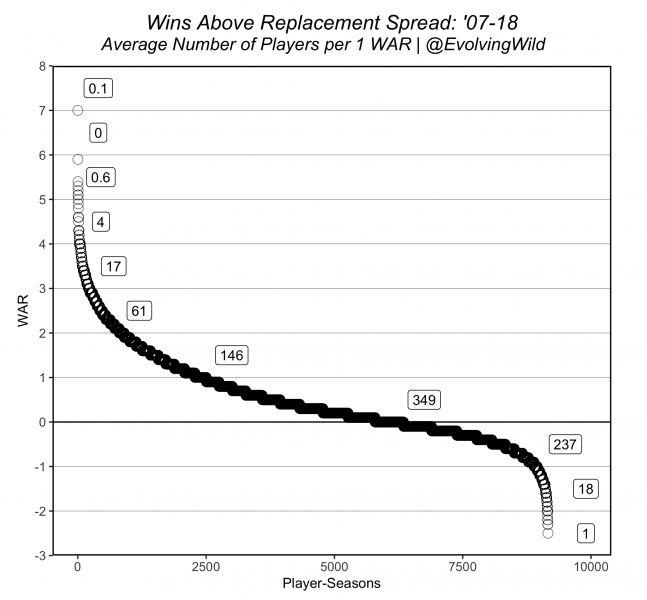
Here we’ve replicated Justin Bopp’s classic WAR spread plot from Beyond the Boxscore to look at the number of players within a given 1 WAR bin on average within a season:

And here is a general rule-of-thumb breakdown (based on the similar table from Fangraphs’ explainer:

Improvements
There are always ways we could improve our methods and the overall model. The number one way we could improve this model is time, oh so much more time. At this point, we’ve been working on this WAR model since August, 2017. This is the 3rd version (one was an initial private attempt completed in October, 2017, the next version was completed at the end of the ’17-18 season, and the final version as of right now was more or less completed in July, 2018). Even with the amount of time we’ve already spent doing all of this, there is always room for more time.
While it’s more of a “change” than an “improvement”, in hindsight the way we constructed our SPM models may be a bit excessive. We set out to be as thorough as possible (read: “if we’re going to do it we might as well do it”). However, this meant an incredible amount of time spent tuning, training, and finalizing all 24 sub-models used in the final ensemble models. As we noted, linear regression does a very good job on its own and could be used alone. This would not only save a great deal of time, but potentially allow for greater interpretability (albeit at the expense of accuracy).
We also feel the discussion regarding replacement level and how to deal with the issues it poses in hockey is an area that could possibly be improved. We hope this might generate some ideas in the future! Additionally, there are ways we could incorporate some type of statistical model to evaluate penalties – WOI, Sprigings, and Perry did this and it would likely look similar. On the subject of penalties, we’re making an assumption that the magnitude of the penalty goal values are in line with the SPM components’ values. We feel that using long-term RAPMs decreases the amount of shrinkage, but the RAPM coefficients will always be biased because of the regularization applied to the regressions. Simply, it’s possible that the magnitude of the penalty goal values are not exactly correct (or vice versa).
Other improvements, in our opinion, would require a completely new framework – something like WOI’s model or Perry’s WAR on corsica.hockey. We’ve taken the “one target variable for each component” approach, but a different framework might include measuring multiple areas within a component. With this approach, we could possibly breakdown how a player is contributing (via shooting or rates or goal-conversion for instance). This model would give us something more in line with the prior hockey WAR models – that is, one that measures what we “expect” a player to contribute or, as we prefer, the Baseball Prospectus naming conventions of “deserved”. If (and possibly when) we take on this endeavor, we’d likely call this overall player evaluation metric something other than WAR, but a more modular method is something we feel has a lot of promise.
There are certainly pitfalls with this “deserved” approach. Mainly, it is very difficult to ensure each module within a given component is constructed in a way that the final number appropriately weights and measures all areas of play (for instance, the shooting talent or shot rate module within a given component may be over/undervalued relative to the other modules etc.) We feel this is a difficult problem to address, and while any model that attempts to measure the entire value of a player will inevitably have these issues, the greater the number of components involved, the more difficult this problem becomes. Additionally, this possibly introduces more problems with replacement level and the ways in which wins are handed out.
Conclusion
As Sprigings did in the past, we’re going to quote the Fangraphs intro to their explainer as a starting point for how WAR should be used and viewed:
“You should always use more than one metric at a time when evaluating players, but WAR is all-inclusive and provides a useful reference point for comparing players. WAR offers an estimate to answer the question, “If this player got injured and their team had to replace them with a freely available minor leaguer or a AAAA player from their bench, how much value would the team be losing?” This value is expressed in a wins format, so we could say that Player X is worth +6.3 wins to their team while Player Y is only worth +3.5 wins, which means it is highly likely that Player X has been more valuable than Player Y.
WAR is not meant to be a perfectly precise indicator of a player’s contribution, but rather an estimate of their value to date. Given the imperfections of some of the available data and the assumptions made to calculate other components, WAR works best as an approximation. A 6 WAR player might be worth between 5.0 and 7.0 WAR, but it is pretty safe to say they are at least an All-Star level player and potentially an MVP.”
While the above is specific to baseball WAR, we feel these two ideas are just as relevant for our model. WAR is often treated, viewed, and sometimes used as the last-point in analysis – that is, the final number as an end-point. In our view, WAR is actually a much better tool when used as a starting point. Especially given the amount of randomness and luck that occurs in the NHL, it’s very important that we not only rely on WAR (and its components) for analysis, but that we dig further when evaluating players. Additionally, we feel it is important to keep in mind the idea of WAR as an “estimate” – there are margins around a player’s final number. Fangraphs suggests a 1 Win +/- error around a given value within a season. It’s not clear where this notion comes from. The methods we used for constructing our model did not allow us to determine error estimates, and while additional research is required to lock this down, we feel a .5 Win +/- error range makes sense given the magnitude for hockey is roughly half that of baseball. The openWAR model in baseball focuses heavily on this area of study in their paper, which is a great read if you’re interested in what this kind of research looks like (linked above).
We challenge others to investigate the model, use it in your research, try to break it, criticize it, like it, dislike it, and everything in between. Our goal was to create a model that would last for the foreseeable future, and while updates will likely occur, the overall framework will not change. This endeavor hasn’t always been fun, and approaching two years of thinking and working on this, it sometimes feels like a nightmare. However, the work has been the most rewarding either of us has done in hockey. Hopefully this may inspire others to try their hand at their own WAR model.
It is a general practice at this point to present studies evaluating the overall performance of the metric that has been described. We will be saving that for its own article. This can be found here [future link goes here], but please don’t wait for that! If you’d like to test out how well our WAR model does, please feel free to test it out. It’s public, it’s (now) explained, and we’re more than willing to answer any questions anyone may have!
Data
All of the data for the model can be found on our website (https://www.evolving-hockey.com/) under the “Goals Above Replacement” dropdown. This includes league, team, skater, and goalie tables and charts. Additionally, we’ve made the R code we use available on our github here. If you have any questions, comments, or suggestions we can be reached on twitter (DMs are open @EvolvingWild), email (evolvingwild @ gmail.com), or in the comments below. Additionally, we’ve compiled all of our references and further reading material in a separate post that can be found here (future link).
Thank you for reading!
Acknowledgements
- Domenic Galamini for his extensive help with our RAPM framework, Goals to Win conversion, and additional advice
- Manny Perry for everything
- Dawson Sprigings for all of his prior public work
- Tom Tango for his foundational work and his assistance with our questions
- All of the writers at Hockey-Graphs for the discussion over the last year or two
well i don’t agree with any of this
The Dallas Stars have 21 wins. So all their players are worth 21 wins. This isn’t that hard???
I feel like there is a way to respect the various game states while still having the league-wide WAR sum to a given number. It makes no intuitive sense that there could be more wins available one year than another given an equal number of games played.
Also, I think the model should be adjusted to only include non-empty-net goals. I don’t have any data, but my hypothesis is that an increasingly higher percentage of goals scored are empty net goals. Which makes sense, since losing by 1 or 100 results in the same outcome.